D&I 2024
Planning and coordinating a workshop that took place at ISIA di Firenze (Florence).
read more
Most of the works introduced here are university projects. I chose to work on them because of my interest in the subjects and my will to learn new skills.
Our tasks for "Diversity&Inclusion" were planning and coordinating an entire workshop that took place at ISIA di Firenze (Florence).
Enhance perspectives, share experience and design new scenarios, in order to break the cultural and social barriers.
The "Diversity&Inclusion" lab was thought with the aim to expose what social media and mass communication don't let us see, making it subject of a dinamic knowledge, free of prejudices and open to equality.
The workshop wants to introduce new points of view and new opportunities for students within the field of Diversity&Inclusion. The focus in on communication, its forms and on studying and approaching to new languages, throught workshops and activities.
Within the team I worked in, I was assigned with many stimulating tasks.
Within these activities, "Diversity&Inclusion" introduced itself as a safe place: everyone could share their opinions, their experiences, or introducing their works.
Our aim was to plan an event as coherent as possible with our intentions, in order to give everyone a good balance among theory, pratice and scientific studies.
One of the hardes tasks was to plan all the 5 days, dividing the activies, calling the guests and planning all the slots. Our idea was to split the days, in order to dedicate the right amount of time to every item, and of course to the lab part.
With these premises, the activities were split among:
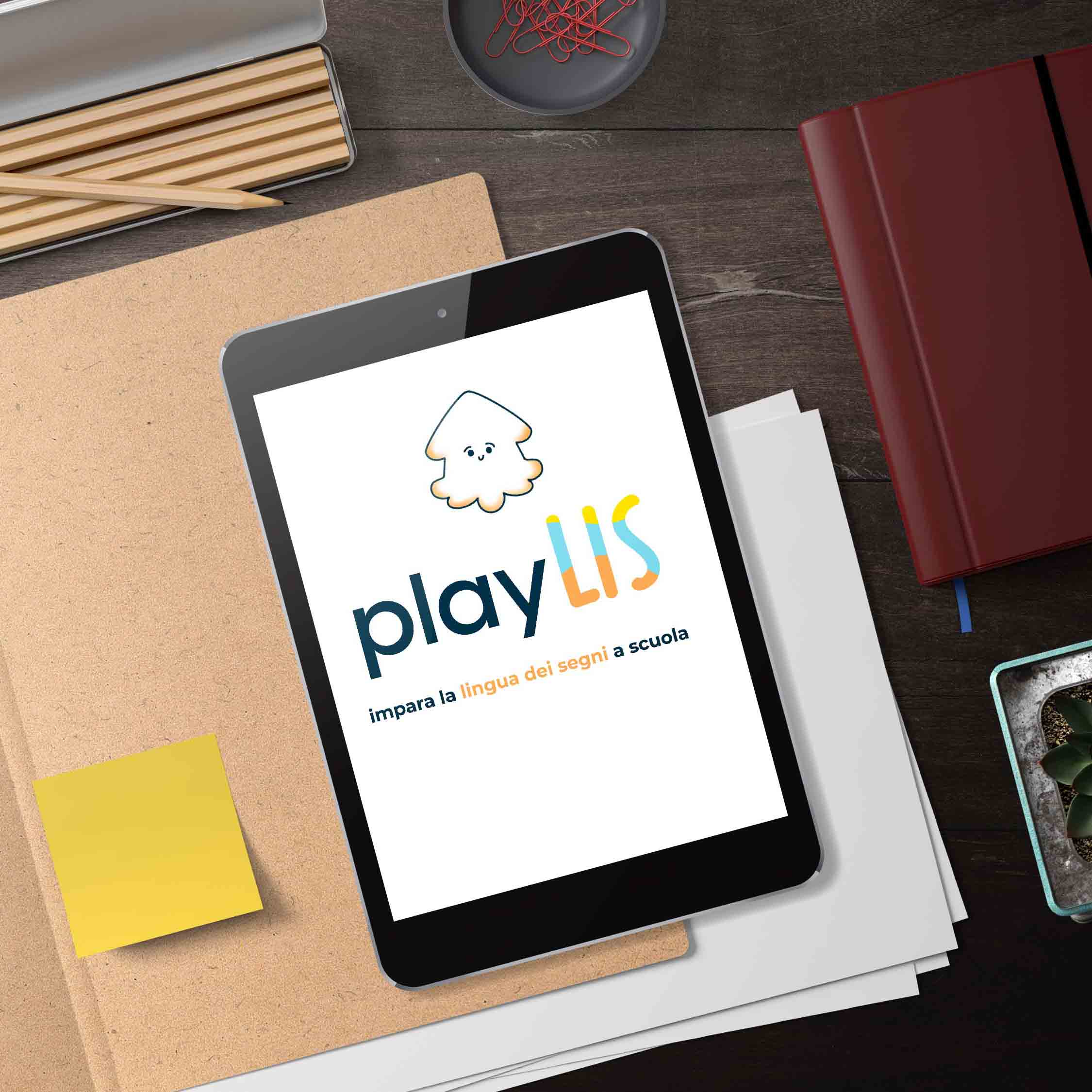
"PlayLIS" is the prototype of a multimedia platform that helps primary school teachers to study and teach the Italian Sign Language (LIS) to their students.
This platform was developed within the Media Literacy laboratory, with the aim to reflect on media education and the use of media for educational purpose.
Our platform comes from the need to learn the sign language (the Italian one, in this case), in order to include deaf people, and from the awareness of how much education is important for our community.
Alongside with our research, we designed a prototype of the platform, that shows the dashboard where you can select the lesson and the following game.
Within the team I worked in, I was assigned with many stimulating tasks.
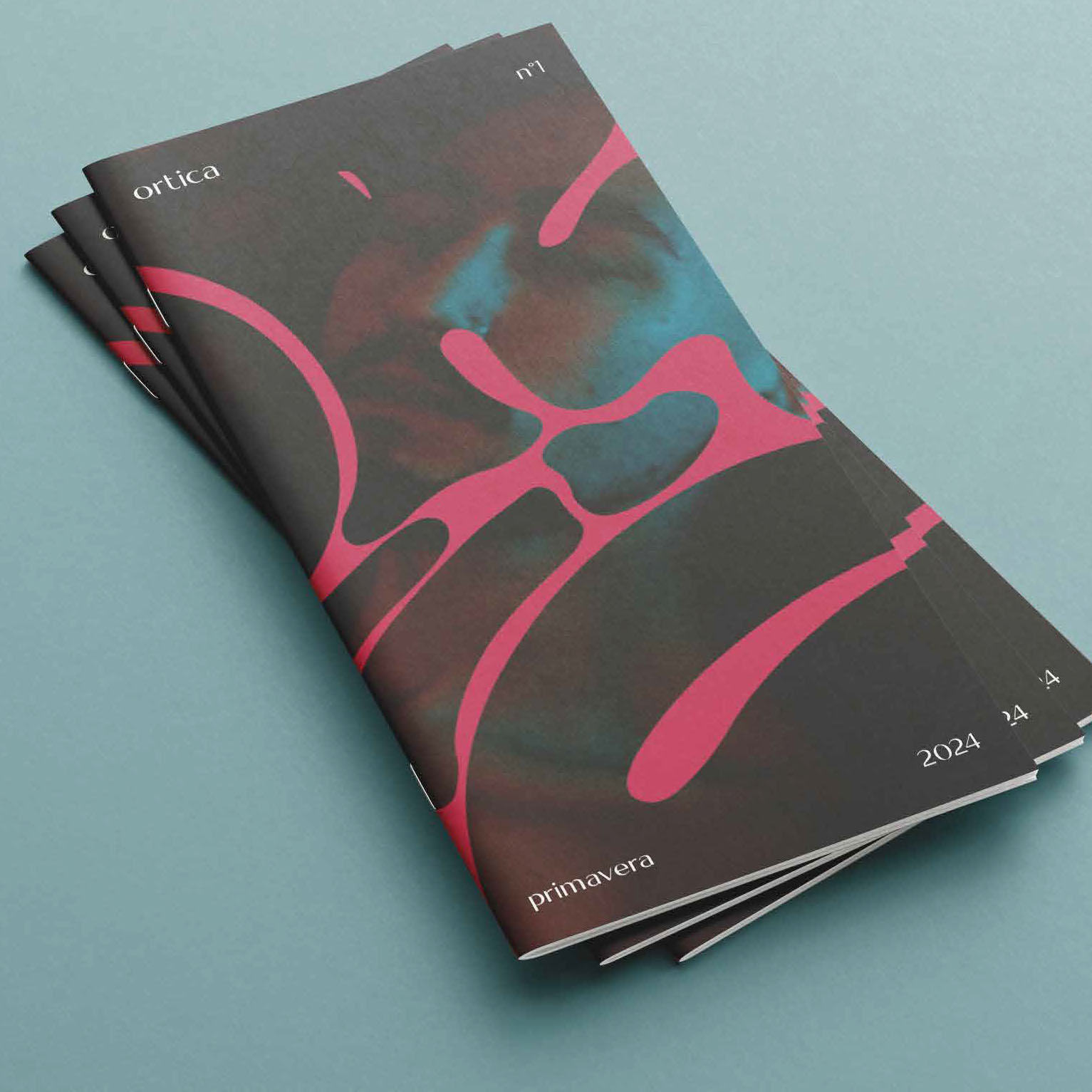
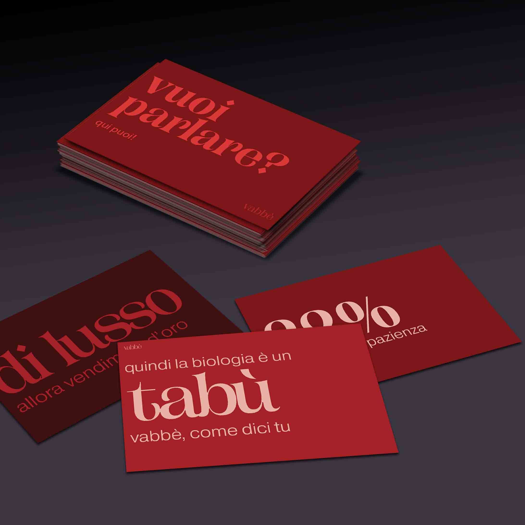
"Ortica" is the itchy sexual magazine. It was developed within the context of "Diversity&Inclusion", during a workshop where we had to create an inclusive brand.
Prickly, rough, and sharp.
Sex work in our society is considered a taboo. The aim of Ortica is to destroy all the prejudices around sex work, to educate people and have a safer, more respectful and healthier image of sex workes. Every article and interview resume voices, experience and pictures: braind and bodies inside the sex work that introduce themself, showing sides that hug and sting our mentality.
A manifest for sex workers: Ortica wants to face our common lives with a quarterly pubblication, associating every season to a specific item. We put together the awareness and human dignity of sex workers and the need to guarantee them a proper access to health and personal protection.
Not just a porno magazine, but its reverse: we used the erotics to flip our ideas of erotics, in order to teach us and everyone to respect it.
I worked to the brand identity with my teammates, wrote the essays and selected the articles and intervirew to put inside our prototype of the no. O of the magazine.
Orticais composed by a magazine and a smaller photo attachment.
"Il Festival del Ciclo Mestruale" ("Period Festival") is a femminist festival that takes place in Milan, during 3 days of May. The 2024 edition is the third of the festival.
A Festival for Every-Body! This year, we focus on bodies: big, small, young, old, tall, short. Bodies with and without period, that had it or not, or are going to.
Withing the course of Graphic Design we were asked to think and design a new identity of an Italian cultural festival, focusing on typography.
After analyzing the festival, its values and stiles, I thought of a new brand identity that focuses on colours, typography and contents, in order to promote inclusivity and empowerment, against all the prejudices about period.
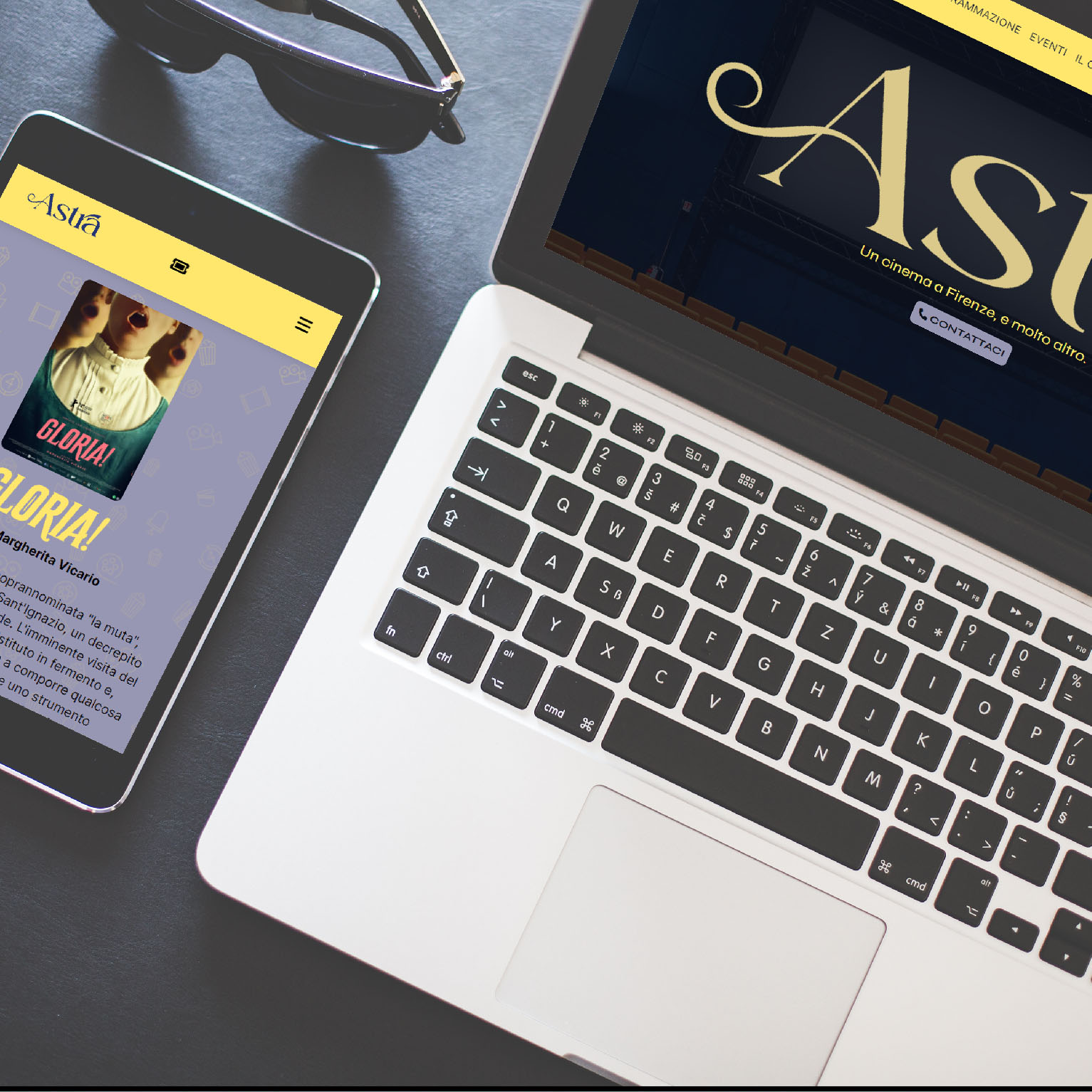
The new website of Astra Cinema was developed as a project withing a course held at university, that asked us to redesign a website.
Alongside with the web design work, I created a new brand identity for the cinema, working on the logo, the typography and the color palette.
Astra Cinema doesn't have an own webiste, but it's insered into the Fondazione Stensen web platform: I decided to think a total indipendent website, working on colors and communication.
So I designed a new modern and more colorful logo, basing the color identity on the contrast between yellow and blu, and showing in the homepage some selection of movies and events, which can't be found on the current website.
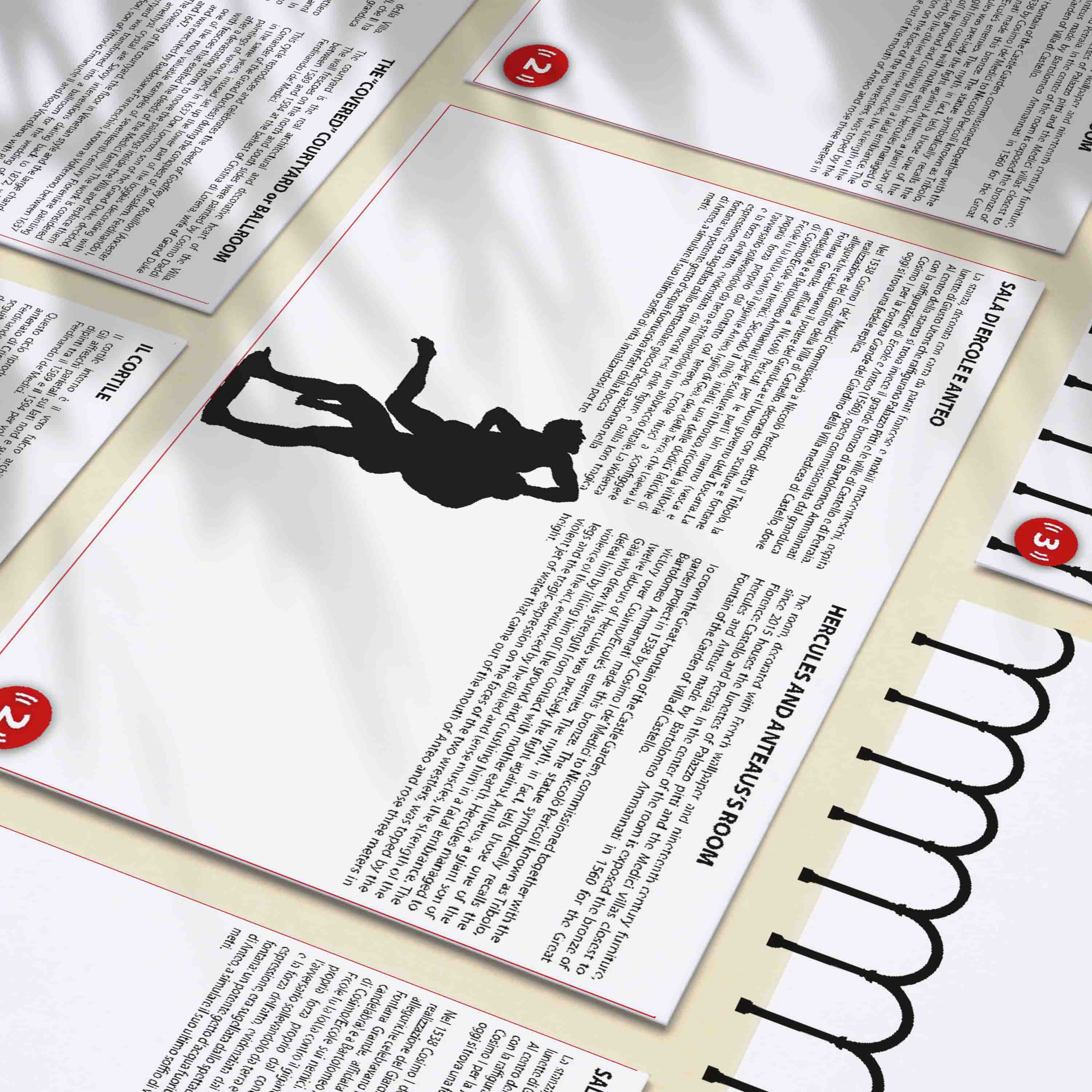
During the internship at Villa Medicea La Petraia, a Medici Villa situated in Florence, the main task I was assigned to was making the new display papers for the museum rooms inside the Villa.
I was asked to achieve Readability and lightness, working on the previous display papers, full of pictures and with a very dark background pattern.
So, I decided to work on both sides starting with a strong color contrast (black/white), using red to highlight the link to the audioguides.
I also decided to put in every paper an illustration made by me of the most important forniture element inside each room.
As I was working for a National museum, I did a lot of research to project an efficient and proper design of the display papers, starting by studying the guidelines of the government.